Will the consequences of a widespread lockdown give rise to more colourful concept stores?
In the wake of a lockdown period during which the global population is staying at home despite the arrival of good weather, people are already thinking about what will happen afterwards. Will brands be rethinking their store concept, which at present is more focused on the essentials and minimalism in the form of brickwork? Designers are currently working on the future of these stores. Now under lockdown, will they choose colour when shops open again? Here are a few avenues already explored by some of them, proving that the era of colour has arrived!
Selected by
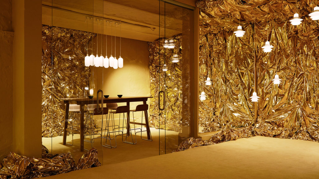
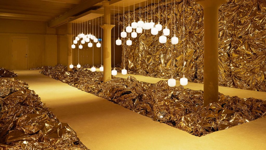
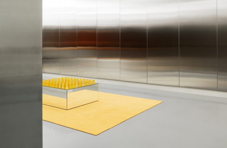
Let’s take the example of gold and yellow
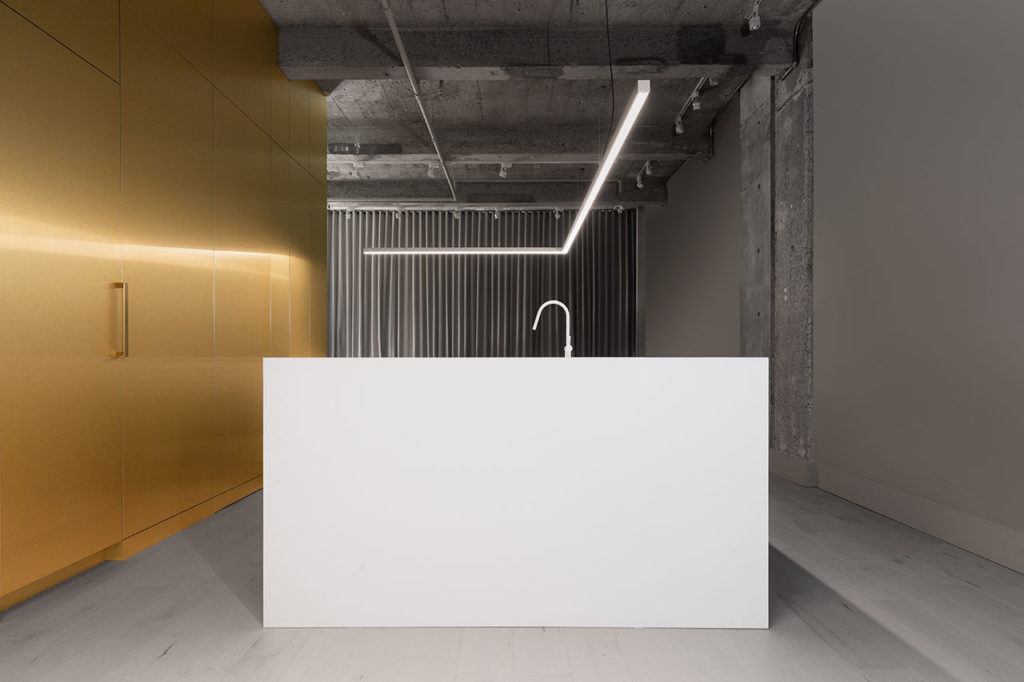
One is a material, the other a colour, and yet they work in harmony with each other. Yellow reflects the light. Unlike other colours, it appears to be the source of light, given the intensity of the effect created. Gold is able to amplify this sensation thanks to genuine reflective properties. It encompasses the light, softening it, making it warmer and mellower.
Selected by
Selected by
The Danish manufacturer Normann Copenhagen has already introduced it in its “Yellow is the new Pink” showroom in reference to their previous monochrome interior design.
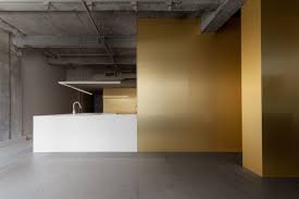
Another example is the Canadian architect Jean Verville, who has brought to life a space that has a deliberately raw finish with simple golden architectural volumes. Despite the architect’s ultra-minimalist touch.
Selected by
Selected by
For those who feel the cold, the all-pastel option is called for
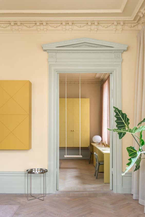
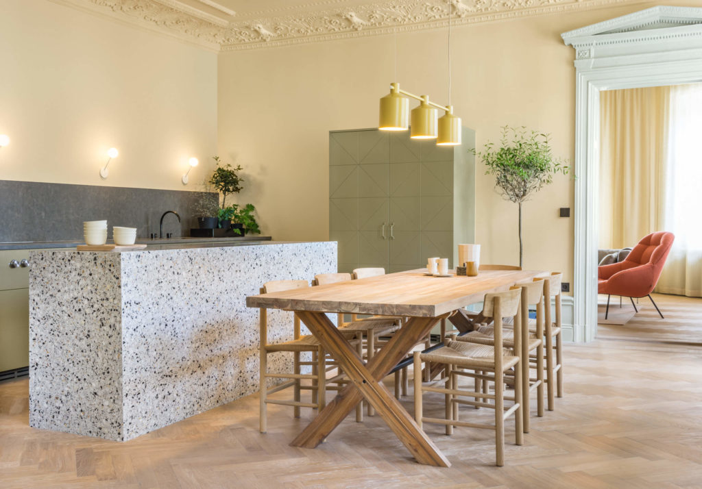
Note Design Studio has developed a range of eight shades for this apartment, which can be tailored to commercial architecture. The result is a harmonious, richly-toned colour experience.
Selected by
Selected by
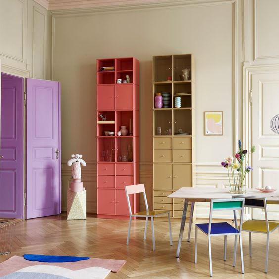
The Swedish furniture brand Montana offers a range of modules in forty-two shades to adapt and combine to your heart’s content. Designed for living spaces, these modules can also be adroitly combined in shops or concept stores to promote accessories and other objects.
Selected by
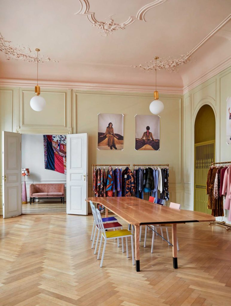
Another Danish brand, the fashion label Stine Goya has revised its entire showroom and shops, drawing on pastel tones and sometimes bolder shades to give these interior spaces a livelier, more colourful dimension.
Selected by


