Limiting materials to create new stores
The Madrid designer Jorge Penadés has designed a store for the highly renowned shoe brand Camper using simple perforated metal profiles.

Selected by
The Camper shop’s architecture
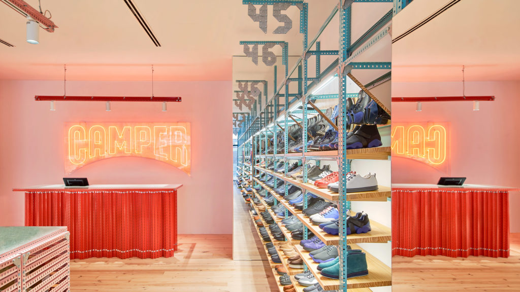
Whereas this could create a cold raw and industrial aesthetic, the designer has added a whole palette of blues and pinks with a touch of bright red.
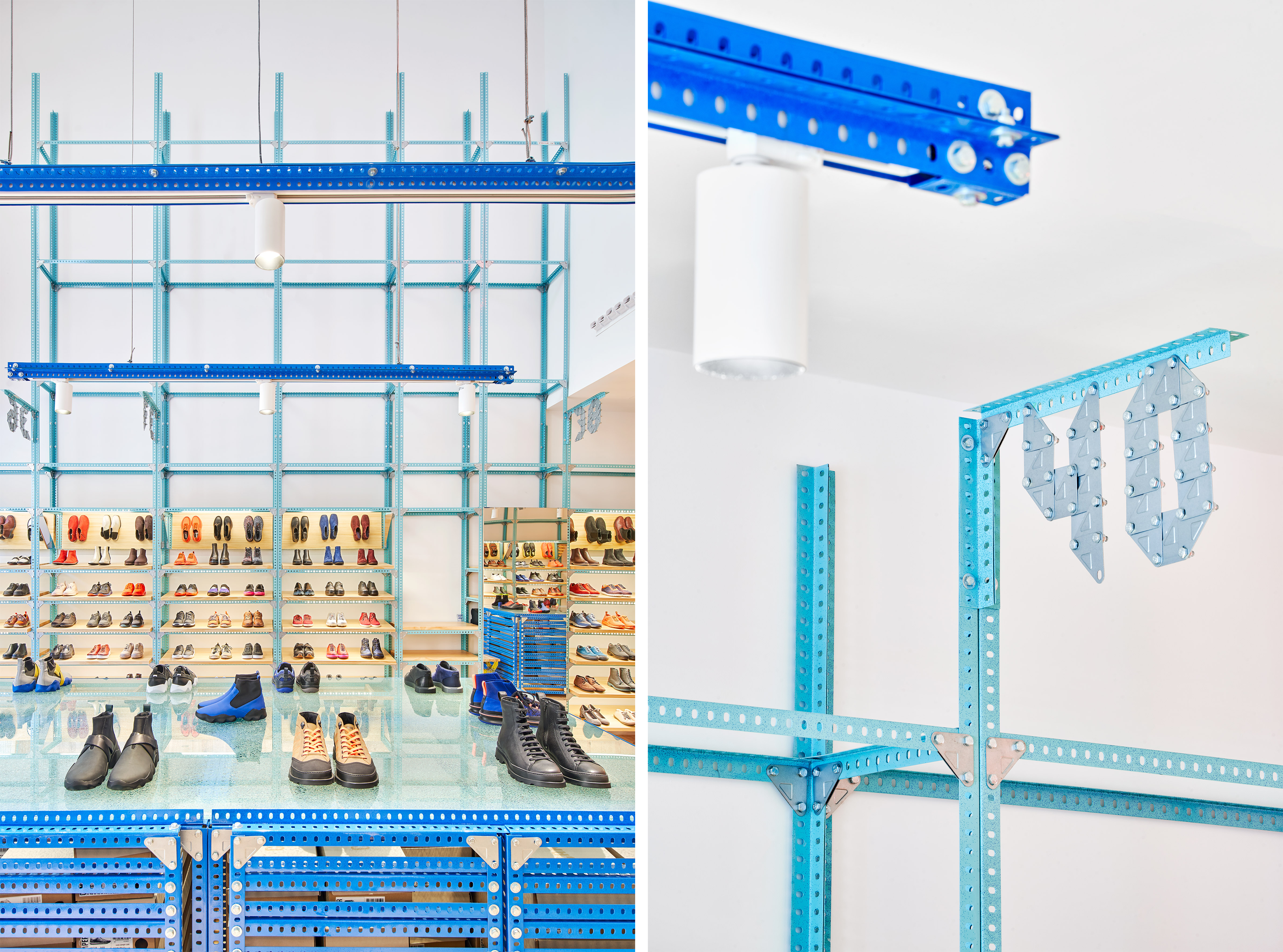
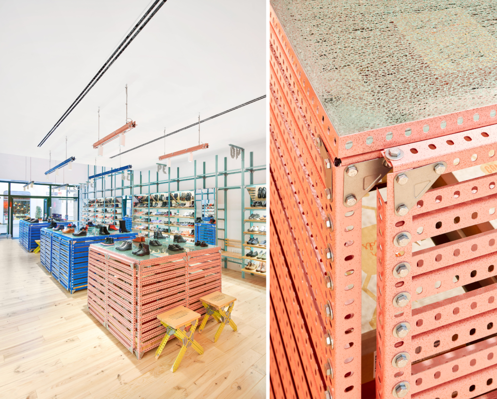
To construct this new store, Penadés used just three basic elements: perforated metal profiles, corner plates and bolts and nuts. Out of a desire for simplicity and to limit the materials themselves, the designer favoured a more responsible approach for the design of this new point of sale. Moreover, the designer and four assistants were all it took to construct the entire structure.
These three elements were used for all the furnishings, from the seating through the cash desk to the light fixtures. The shoe sizes on the shelves are even marked on corner plates bolted together.

Selected by
To distinguish each area, the designer has allocated a specific colour to each space. The wall displays are green, while those on the tables are blue for boys and pink for women. The seats are yellow and paying is red! Everything has been reinterpreted using this simple material, such as the brand logo and a new typography made entirely of perforated metal profiles. The shop’s design is a nod to the brand’s warehouse located in the small Mallorcan village of Binissalem, where the brand’s bespoke and archive pieces are stored, including items by Gaetano Pesce, Ingo Maurer, the Bouroullec brothers and Konstantin Grcic.

Selected by


