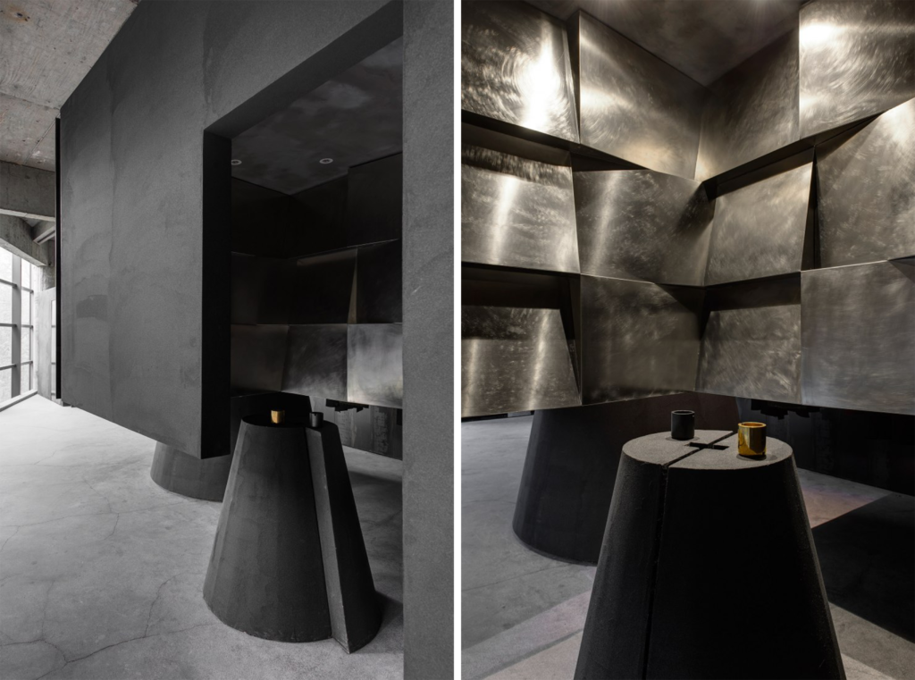
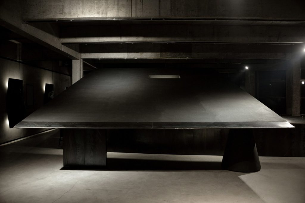
Heike’s monochrome concept store in China
Designed by Shanwei Weng and Jiadie Yuen, the founders of AN Design, the Heike brand’s new monochrome concept store offers an unexpected approach to store design. Blending a design-forward and minimalist aesthetic, the Heike store has also been conceived as an art gallery that hosts exhibitions and events.
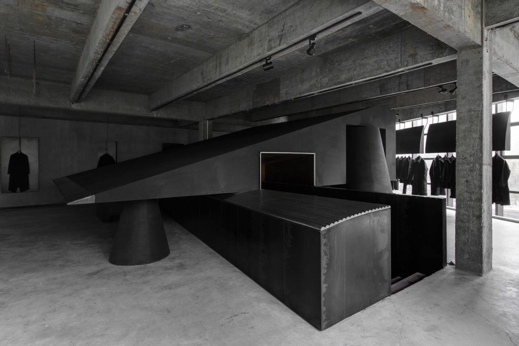
Blending a minimalist aesthetic and geometric design
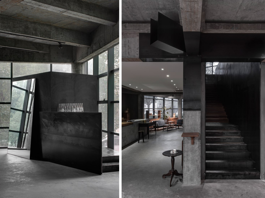
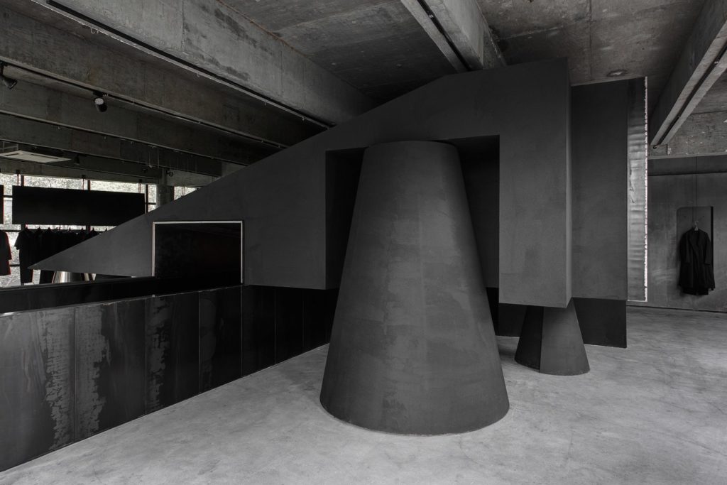
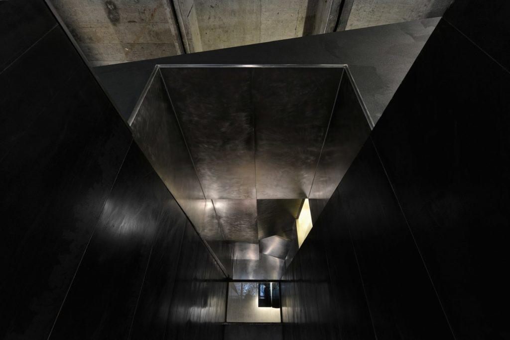
The Heike fashion concept store is hidden on the second floor of a furniture shop. The space is structured around an imposing sculptural central staircase in an intense black named the “Black Cant”. The concept store is made up of geometric shapes, minimalist furnishings and a wide variety of raw materials such as concrete, steel, aluminium and mirrors, giving the whole setting an industrial look.
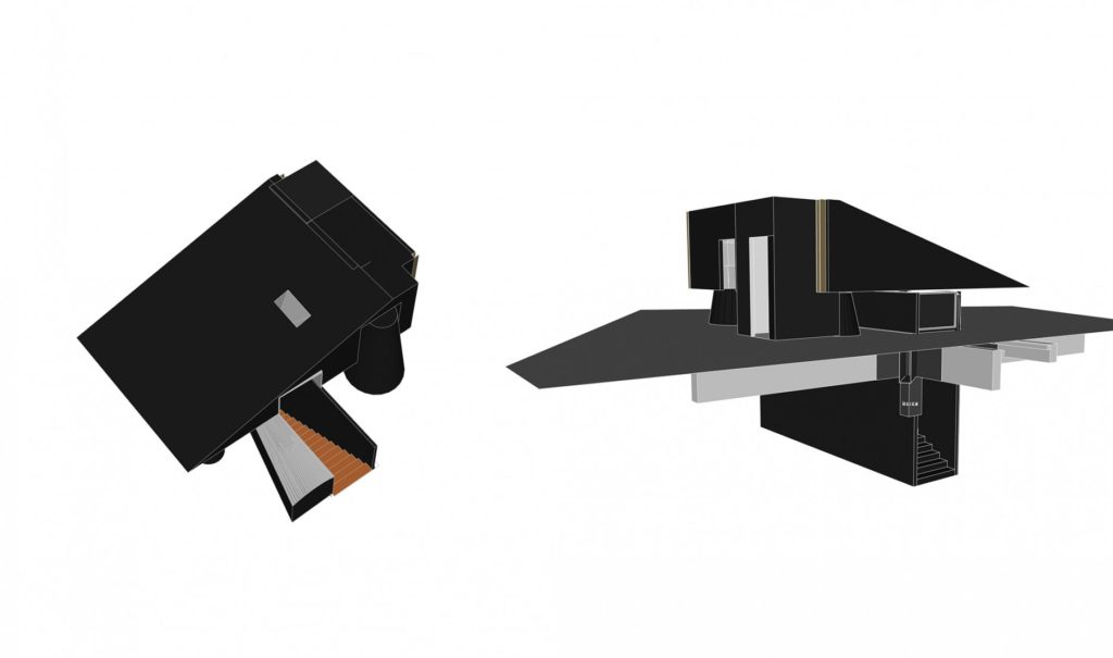
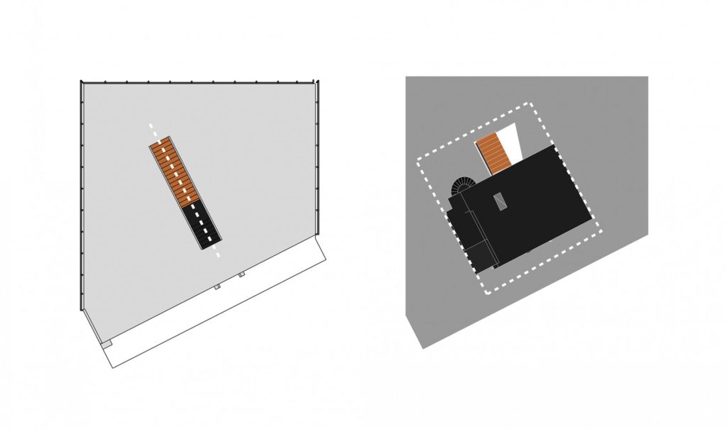
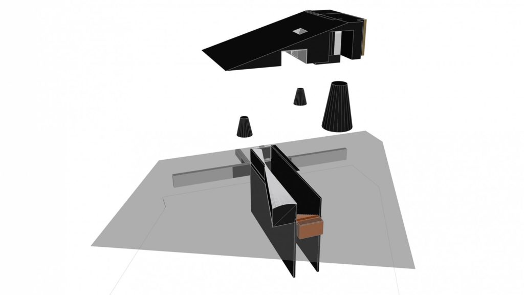
Different textures have also been used to create matte and shiny surfaces in shades of grey and black, set off with silver or golden accents. Large picture windows flood the space with natural light like a huge artist’s loft or a warehouse. The clothes are hung and the mirrors placed directly on the ground to create this raw, unaffected atmosphere.
A poetic experience
The Heike concept store is a project that offers a conceptual and spatial poetic experience that aims to create an innovative example of design for a fashion store. The space’s very raw and minimalist look thus calls into question the conventional idea of a fashion store, which is usually characterised by a profusion of decorative elements.
Heike offers a different approach that creates a melancholic, futuristic atmosphere. Like an art gallery, the concept store also hosts exhibitions and events, transforming into a place for people to meet and interact.
