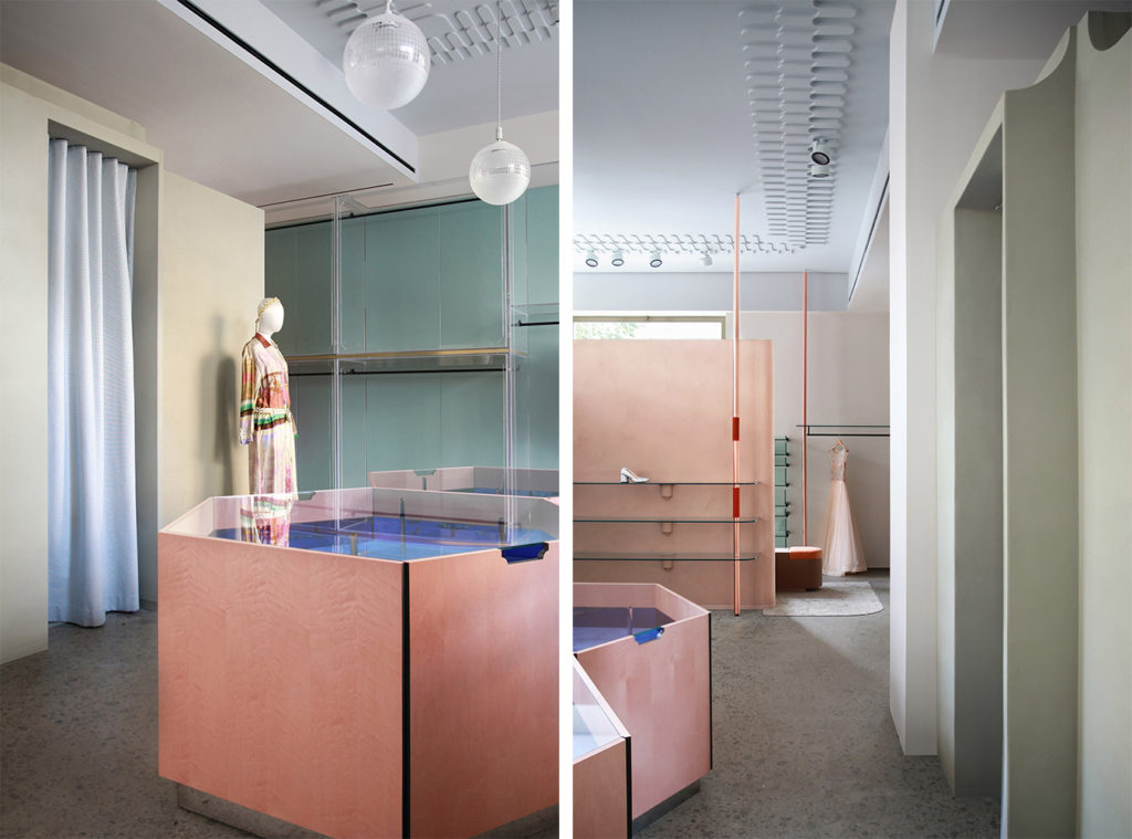
Architectural structure for the Imarika boutique in Milan
The clothing brand Imarika has called on the Marcante studio to rethink the design of its Milan store near the “Porta Venezia”. Known for its unexpected material mixes and colour detailing, in this instance the Marcante studio has created an atypical all-pastel setting!
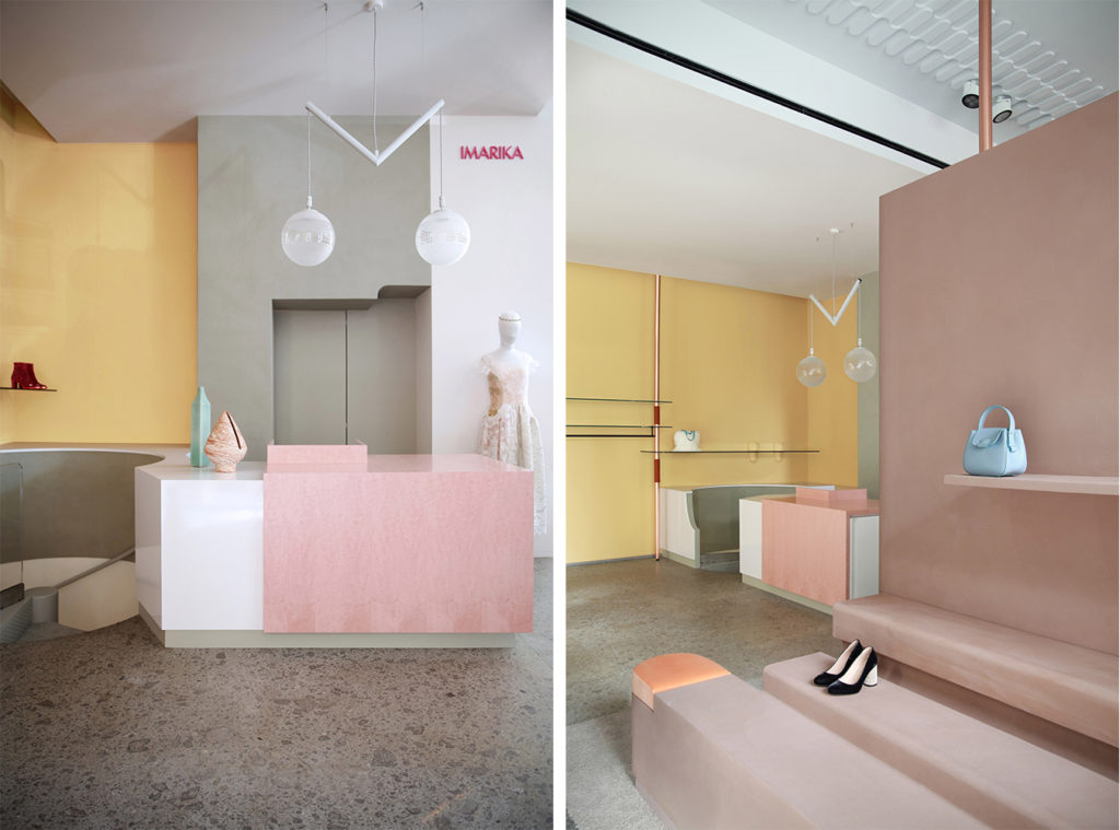
An architectural space
The 180-square-metre space has been refashioned by the Marcante design studio to give it a unique architectural structure in contrast to the sometimes sterile and neutral decors of modern boutiques. Instead of creating several rooms, Marcante has chosen to divide the space using pink clay partitions, copper pipes and Perspex panels.
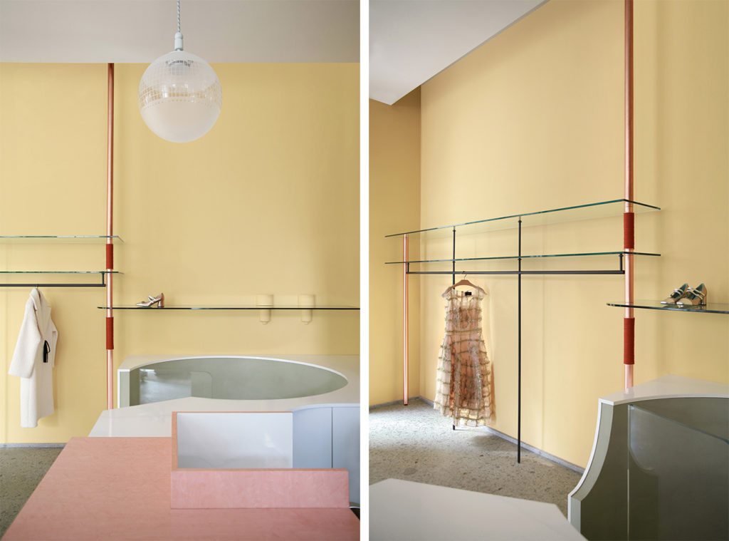
However, far from thinking solely of the space’s aesthetic appearance, designers Andrea Marcante and Adelaide Testa wanted it to be above all functional and for each part of the space to also be able to serve as a product display or support clothes rails.
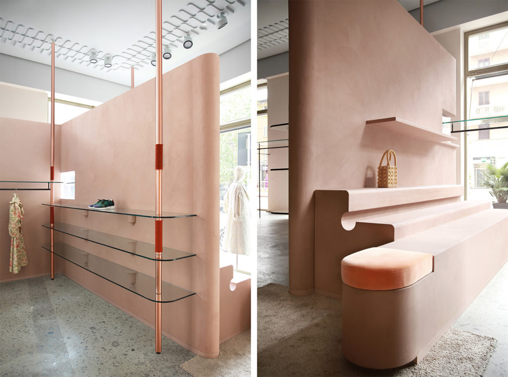
Inspired by the fifties’ look
The Imarika boutique’s design is reminiscent of Olivetti’s iconic stores from the fifties. At the time Olivetti, working with the architect Gae Aulenti, had the revolutionary idea of arranging all the typewriters along the walls of its Paris store on stepped platforms.
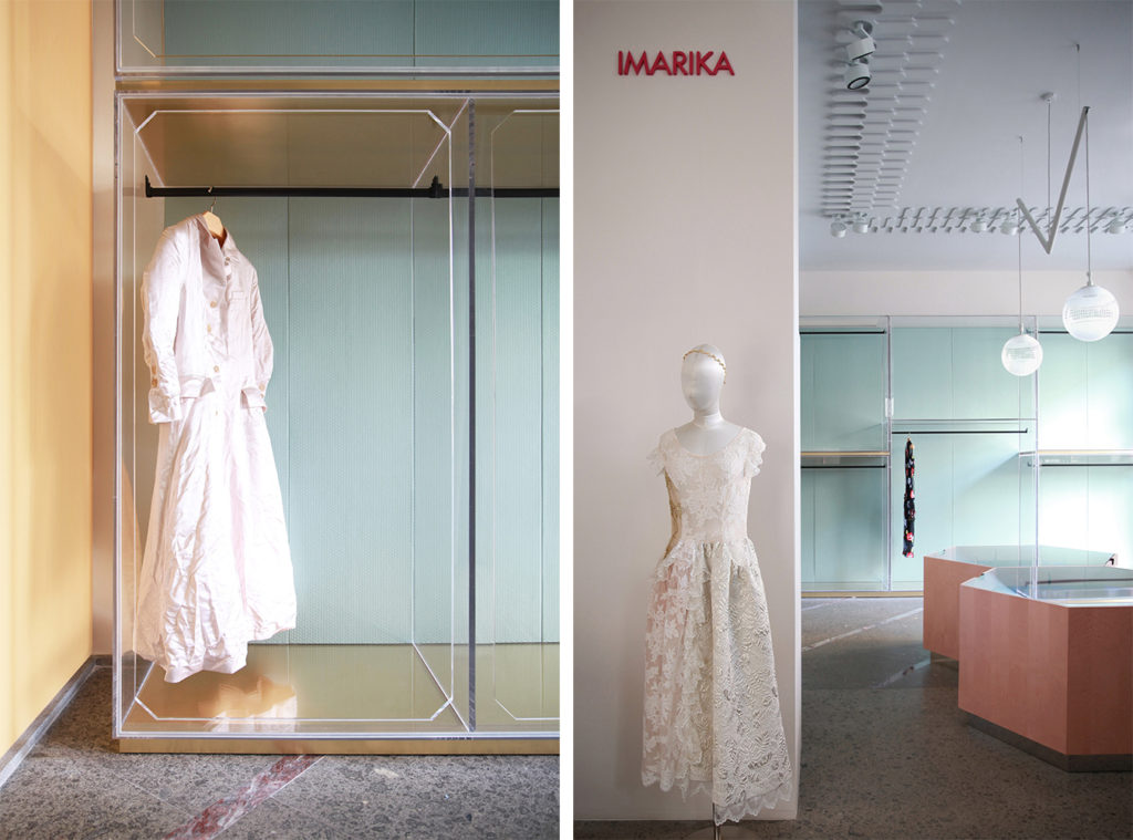
Pastel colours, such as powder pink, topaz yellow and sea green, contrast with the original grey marble floor, adding a vintage retro touch to the Imarika boutique.
